Tags
Warm and cool colours in a painting
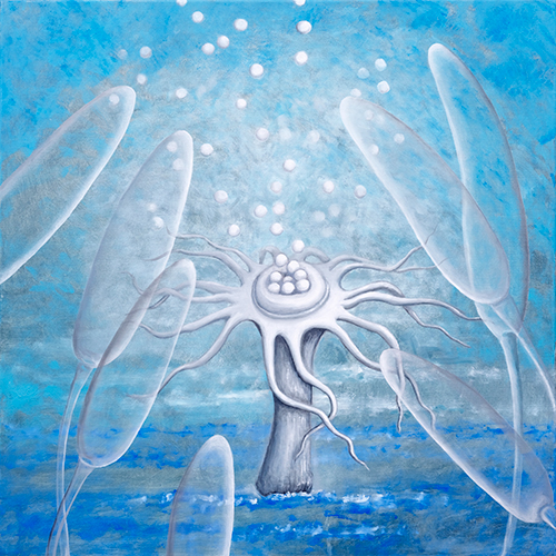
When people choose a painting for a room they usually look at the subject — flowers, trees, abstraction. Yet how the room feels afterwards depends more often on colour temperature than on what is depicted. The same subject carried in blues and in yellows pulls a room in two different directions.
What makes a colour warm or cool?
It is a practical division, not a physical one. Warm colours are yellows, oranges, reds and everything leaning towards them — including greens with yellow in them, and browns. Cool colours are blues, turquoises, violets and greens leaning towards blue. The line is not sharp: the same red can look warm beside blue and cold beside orange. Colour temperature is always relative — what sits next to it decides.
How does it work in a room?
Warm colours visually come closer. A painting in yellows and oranges on the wall facing the door makes a room feel shorter and more enclosing, and the light warmer — this works especially in rooms with north-facing windows, where daylight stays greyish all year.
Cool colours recede and calm. A painting in blues on a large wall opens the space and eases a sense of crowding. That is why a cool palette suits bedrooms, and rooms that already get plenty of sun — in a south-facing living room a cool painting balances an excess of warm light.
When is a cool painting a mistake?
When the room is already cold — north-facing windows, grey walls, daylight without sun. A painting in blues adds to that impression and the room becomes not so much calm as unwelcoming. Somewhere like that, a warm accent works better, even a small one.
The opposite mistake is rarer but real: a strong warm painting in a small dark room can close it in even further.
How to test it before buying
The simplest way: hold a sheet of paper in a colour close to the painting's dominant tone against the wall and leave it there for a day. Morning, midday and evening light differ, and the same colour looks different in each. One day of watching tells you more than an hour spent studying a photograph on a screen.
Bear in mind that screens mislead in both directions — monitors emit their own light and usually push saturation up. That is why every work here lists its dimensions and medium, and why you can ask for an extra photograph taken in daylight before you buy.
Cookies
We use cookies to personalise content and ads, to provide social media features and to analyse our traffic.
We share information about how you use our site with our social media, advertising and analytics partners. They may combine it with other information you have given them or that they have collected from your use of their services.
- The site does not work without them. Always on.
- Remembering your choices, such as language.
- Anonymous visit counts, so we know what is being viewed.
- Tailoring ads outside this site.